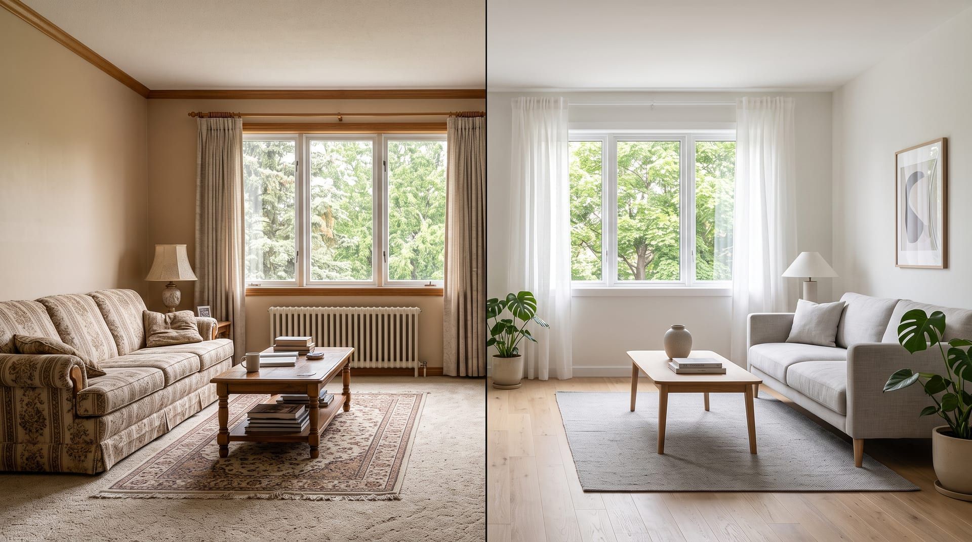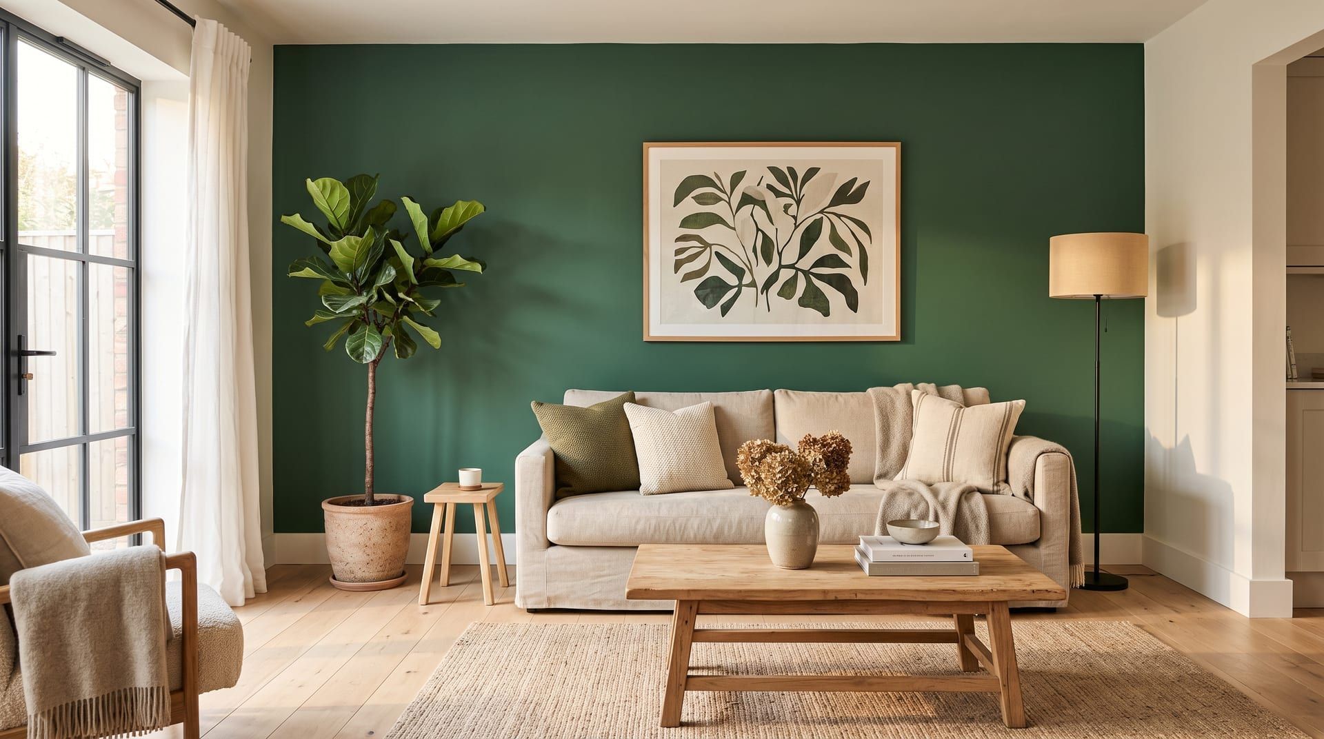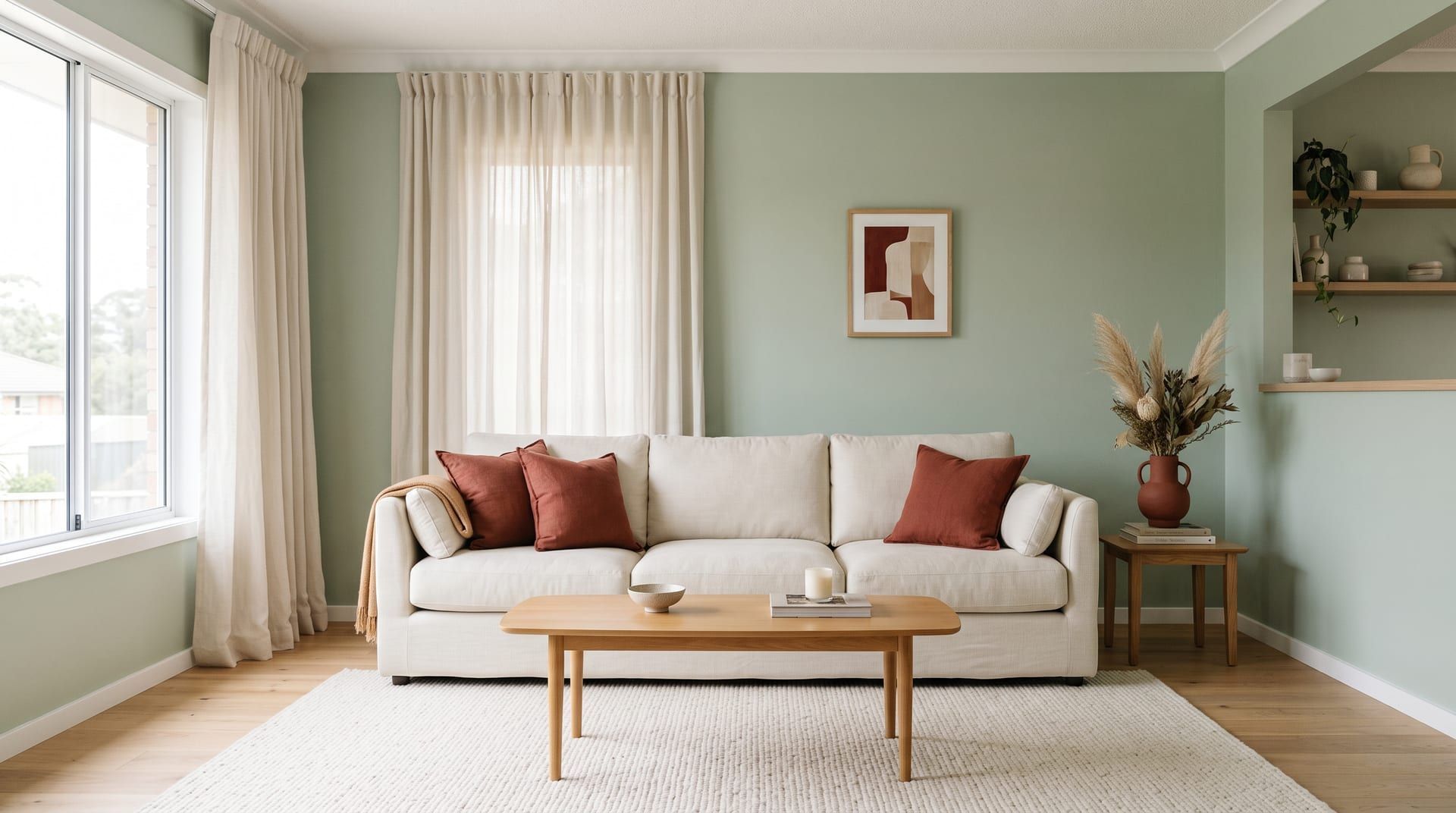
The 60-30-10 color rule is a simple way to balance colour in a room. One main colour covers about 60 percent of what you see, a second colour covers about 30 percent, and an accent colour covers the last 10 percent. In practice, the 60 is the walls, the 30 is the large furniture and curtains, and the 10 is cushions, lamps, art and small objects. The split stops a room from looking flat (one colour) or busy (many colours in equal amounts).
Below, one bedroom is shown in three palettes that follow the rule. Only the colours change. The camera, the furniture and the layout stay the same.
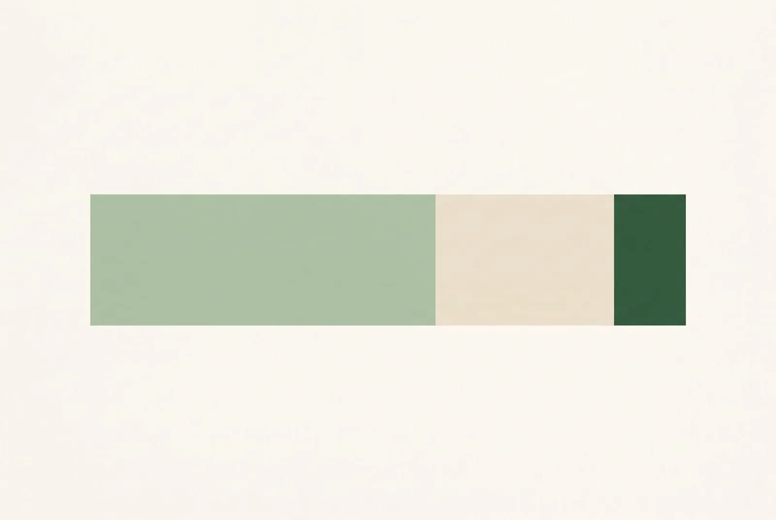 The rule as proportions: a dominant colour, a secondary colour and a small accent. An illustration for this article.
What goes in the 60, the 30 and the 10?
| Share | Role | Where it usually goes | Typical choice |
|---|---|---|---|
| About 60% | Dominant colour | Walls, the largest rug, sometimes a large sofa | A calm, light or mid-tone colour |
| About 30% | Secondary colour | Sofa or bed, curtains, an accent chair, cabinets | A colour that contrasts with the 60 but is not loud |
| About 10% | Accent colour | Cushions, throws, lamps, vases, art, a single small chair | The strongest or brightest colour in the room |
The percentages are by eye, not by measurement. Stand in the doorway and ask what you see most, what you see second and what catches your eye last. The ceiling, a white trim and a natural wood floor sit in the background and are usually left out of the count.
One bedroom in three palettes
Each image below is the same bedroom. In each one, the walls carry the 60, the headboard, bed base and curtains carry the 30, and the cushions, the throw and the lamp bases carry the 10.
Warm neutral: cream, caramel and terracotta
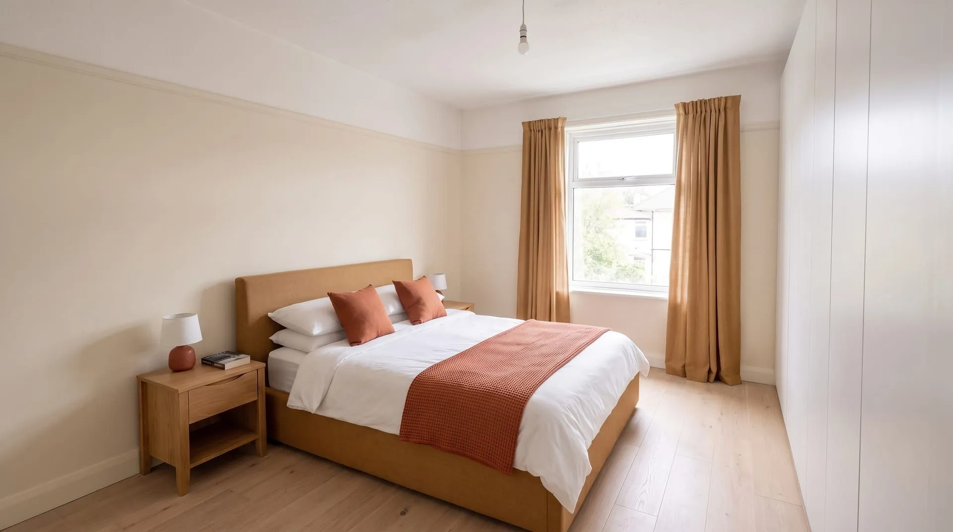 Cream walls, caramel bed and curtains, terracotta accents. Generated with remyhomeai’s AI model from one sample photo.
This is the safest version. Cream walls stay light in any daylight. The caramel bed and curtains add warmth without contrast that feels sharp. The terracotta accent is close in temperature to both, so the room reads as one warm family. It suits rooms facing north, which get cool light all day.
Sage and cream: green, oatmeal and forest green
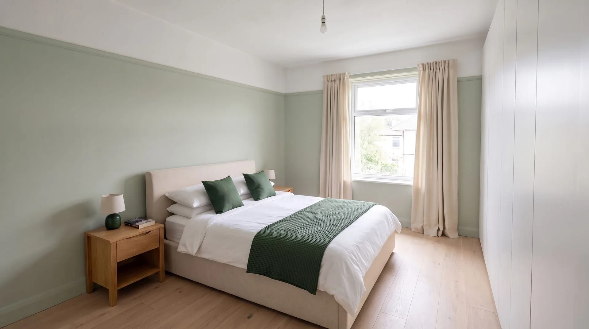 Sage walls, oatmeal bed and curtains, forest green accents. Generated with remyhomeai’s AI model from one sample photo.
Here the accent is a darker shade of the wall colour. This is a monochrome take on the rule: calm and hard to get wrong, because all three colours share one family. The cream in the middle keeps the two greens apart. It suits Scandinavian and Japandi rooms and any room where the goal is rest.
Navy: navy, off-white and mustard
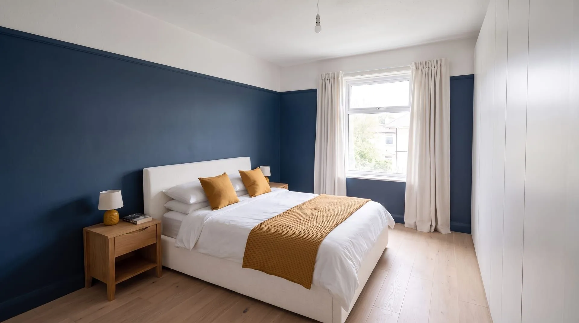 Navy walls, off-white bed and curtains, mustard accents. Generated with remyhomeai’s AI model from one sample photo.
A dark 60 makes the bedroom feel enclosed and calm at night. The off-white 30 stands out sharply against it, so the bed becomes the focal point. Mustard sits close to the opposite side of the colour wheel from blue, so a small amount of it stands out strongly. This is the boldest of the three and works best in a room with good daylight or one used mostly at night.
| Palette | 60 (walls) | 30 (bed, curtains) | 10 (accents) | Feel | Best for |
|---|---|---|---|---|---|
| Warm neutral | Warm cream | Caramel tan | Terracotta | Warm, soft, safe | North-facing rooms, first-time colour |
| Sage and cream | Soft sage | Oatmeal | Forest green | Calm, natural | Bedrooms, small rooms, Scandinavian style |
| Navy | Deep navy | Off-white | Mustard | Bold, cosy, high contrast | Rooms with good light or used at night |
How do you choose the three colours?
Start with what you will not change
List what stays: the floor, a sofa you love, kitchen cabinets, a rug. These already take a share of the room. If you have a large grey sofa, grey is already part of your 30. Build the other two around it.
Pick the accent first if you love one colour
Many people know the one colour they want, for example terracotta or emerald. Put it in the 10, where a strong colour works best. Then choose a calm 60 that sits well next to it, and a 30 that bridges the two. The color palette from photo tool pulls a palette from any photo you like, such as a painting or a holiday picture, as a starting point.
Use one of three simple relationships
- One colour family (monochrome): a light, a mid and a dark version of one colour. Calm and safe. The sage bedroom above is this kind.
- Neighbours (analogous): colours next to each other on the colour wheel, such as cream, caramel and terracotta. Warm and easy.
- Opposites (complementary): a colour and its opposite, such as navy and mustard. Strong contrast. Keep the opposite colour in the 10.
Test the 60 on the wall
The 60 is the colour you live with most, so test it before you buy. Paint large samples on two walls and look at them in the morning and the evening. The paint finish matters too. The flat vs eggshell vs satin paint guide explains which finish to use where.
When should you break the rule?
The rule is a starting point. It falls short in these cases:
- Colour drenching. Painting walls, trim and ceiling in one colour is a deliberate break. The room becomes close to 90 percent one colour, with texture and wood doing the rest of the work.
- All-white or neutral rooms. In a minimalist room, the 60, 30 and 10 can be three shades of white, oat and stone. The rule then works through tone and texture, not colour.
- Rooms with a strong fixed feature. A brick wall, a patterned tile floor or a large window view already brings a colour. Count it in, or let it be the accent and keep everything else quiet.
- Pattern. A patterned wallpaper or rug contains several colours at once. Pick its main colour for the group it belongs to, and pull the accent from one of its small colours.
- Open-plan spaces. One 60 across the whole space keeps it calm. Each zone can then have its own 30 and 10.
The rule also does not say anything about light. The same navy looks soft in a south-facing room and almost black in a north-facing one. Always judge colours in the room itself.
Try palettes on your own room first
Recolouring the walls, the bed and the curtains is a big job to undo. The three bedroom images above were made by editing one photo. remyhomeai does the same with a photo of your room: pick one of 7 styles and one of 39 colour palettes, such as Sage & Cream, Midnight Navy or Warm Minimal, or describe your own three colours in the free-text field. Tick Keep on the floor, doors or windows so only the colours change. It shows the look, not the exact paint, so take the final colour from real samples. The bedroom page shows what a redesign changes in that room.
Try it on your own room. See your room in a new style with 3 free designs at signup, no card required.